Data visualisation principles
August 12, 2019•608 words
The motivation to write these lines came from seeing both bad/good visualizations, both at work or in the medias. So here are some principles that should help build better visualizations or detect flaws in poorly designed visualizations. I'll start assuming you have some data (symbols, signs, bytes, characters….) that you interpreted to get some information out of it. You now want to communicate it and present it to others. One effective communication is often visual communication. Back to data, you have basically two options: tables or graphs.
Graph or table?
First of all ask yourself if you really need a chart. Unlike data tables, graphs are not meant to provide precise quantitative values. Graphs reveal patterns, trends, relationships and exceptions that would be difficult to discern from a table of values.
Sometimes the best graph is no graph.
Visual attributes
Let's now assume you found out you do need a graph. It's good to know some things about visual perception from a physiological perspective to understand what works and what doesn't. Your eyes are able to detect a limited set of visual attributes (e.g color, shape, size….). Due do pre-attentive processing some of these visual attribute are perceived extremely fast without any conscious effort. Why should you care? Because you want to visually encode your information so that it is perceived instantly and easily. Here are some pre attentive visuals attributes, from the most to the least "accurately perceived":
1.Position
2.Length
3.Angle/Slope
4.Area
5.Volume
6.Color Hue/Density

- Position and length being better perceived, they are better suited for encoding quantitative data --> how much?
- Colors or shapes are better suited for encoding categorical data --> what?
Which type of graph?
Ask yourself what do you want to show.
| Purpose | Graph type |
|---|---|
| Comparison | Between items: bar charts, over time: line charts |
| Distribution | Histograms |
| Relationship | scatter chart |
| Composition | stacked bars chart, waterfall chart |
This document provides useful help when it comes to choosing the right chart's type.
Best pratices
Here are some recommendations before finally building your graph:
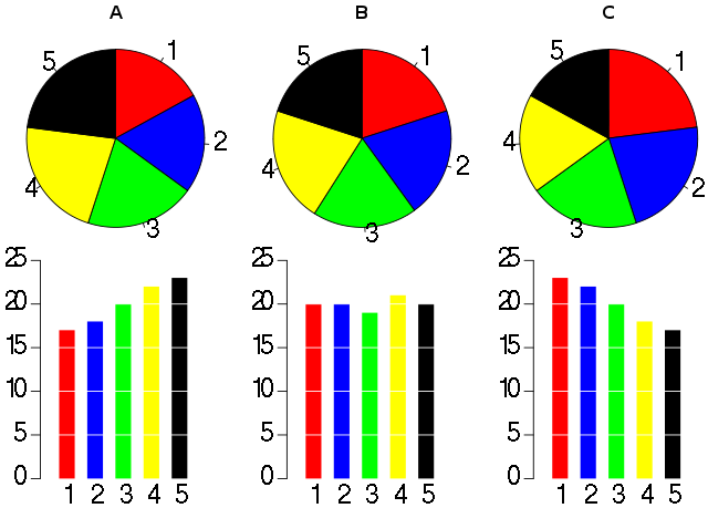
Save Pies for dessert
Although Pies are good to show part-of-whole relationship, pies use areas as a visual encoding which is not so accurate. And it also often requires using redundantly colors to distinguish values.
Prefer bar charts over pies!
On which chart is it honestly easier/faster to read/order/get sense of the data values without having to explicitly label them?
Colors
Use different colors only when they correspond to differences of meaning in the data. In the example above color was actually redundant for the bar charts.
Colors are appropriate to show:
- categories (different values per item)
- sequence
- divergence
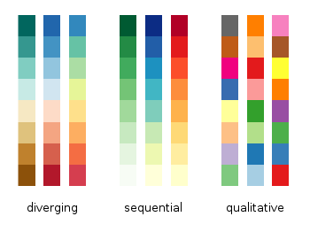 Besides these cases, it is very likely that using color (or more than one) is redundant. It should not be carnival on you chart. You are doing data visualization, which is about understanding: an effective chart may look "boring". You are not doing data art, which is about entertaining.
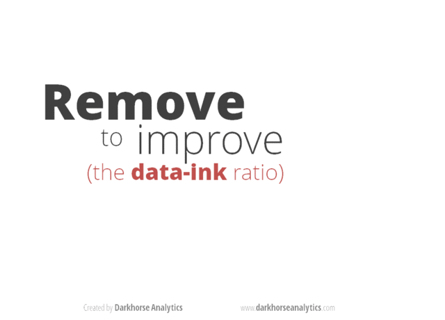
Data look better naked
Remove from your graphic all the ink/pixels that are not related to the numbers/values you actually want to represent (concept of maximizing the data-ratio from EdwardTufte). This includes removing: background, frames, axis, shadow/3D effects, gridlines...
You should grasp the idea looking at this animation:
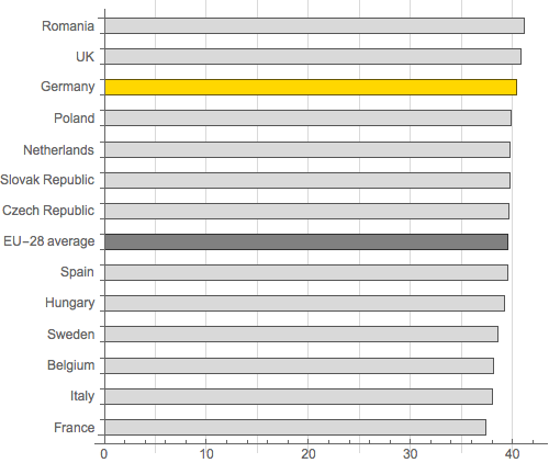
Avoid not making your vertical axis start at 0
It is confusing and may convey a wrong message.
On this first chart, it looks like Germany has a big edge over countries like France or Italy.
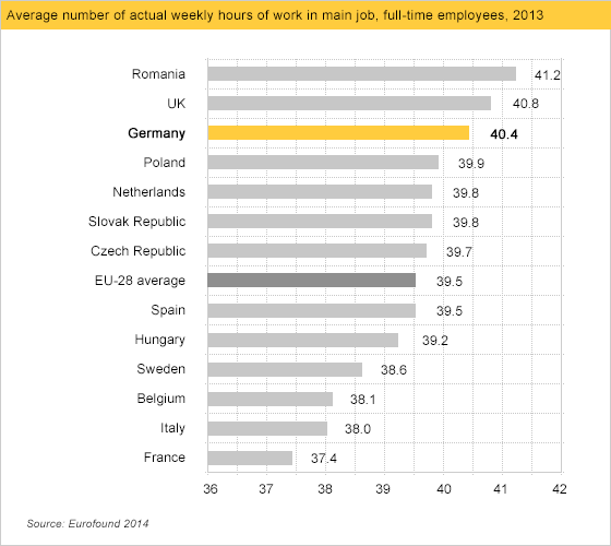
While actually...
Credit & further reading: most of the concepts I have just summed up come from www.perceptualedge.com.