Sometimes less is more
April 24, 2019•202 words
Sometimes with CSS, as with many other things in life, less is more as I've learned with CSS grids today. The idea was simple since I was using grids for the main templating of the app, I would use it also for the actual lines in chat make them all multi-row grids with columns for time, badge, nick and message. The implementation of that idea was fairly simple and worked well until I added a very long message to the test data, then things started to get harder. The result was this:
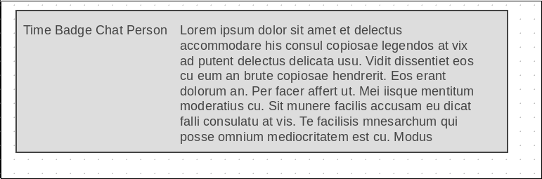
The line was mostly correct except the text was being restricted to its own column instead of overflowing under or to another row. Then came the research and experimentation to try and get the text to overflow correctly. Finally, after spending a lot of times I just got back to less and got my solution, instead of using grid the easiest and working way was to simply go with
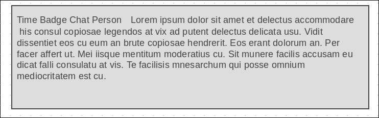
So, in the end, less was more and simple was better with CSS as with so many other things.