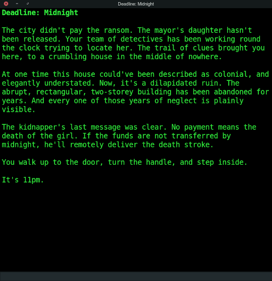
User Interface - The Three Windows
March 7, 2022•258 words
TAF uses a very simple user interface. It doesn't require anything overly-complicated. Anything too sophisticated will get in the way of the intended look, feel , and atmosphere I'm trying to achieve.
Main Window
The main action takes place in one window. The aesthetic is a throw-back or homage to the era of green screen visual display units that were in vogue when the first text-based adventure games were created.

The text is coloured as close as possible to the actual shade of green that was used in the early cathode-ray tube VDUs. The colour is #33F33F, or 51,243,63 in RGB notation.
A text entry field is located at the bottom of the window.
Trace Window
The diagnostic trace window displays information that is only of interest to the developers of the software. It is not intended for player consumption. In normal game-playing circumstances the trace window is hidden.

The text colour is an arbitrary shade of yellow.
Timer Window
This is a digital clock that counts down to zero. The starting value is either a default value of 60 minutes, or a value defined within the current game. The game author can set whatever time limit for the game that they choose.

Having the timer window visible lets the players know exactly how much time they've got left. If they don;t want the aded tension of seeing time tick away the timer window can be hidden. It keeps time whether it is visible or not.