
How Website Accessibility and Usability Work Together
October 23, 2026•955 words
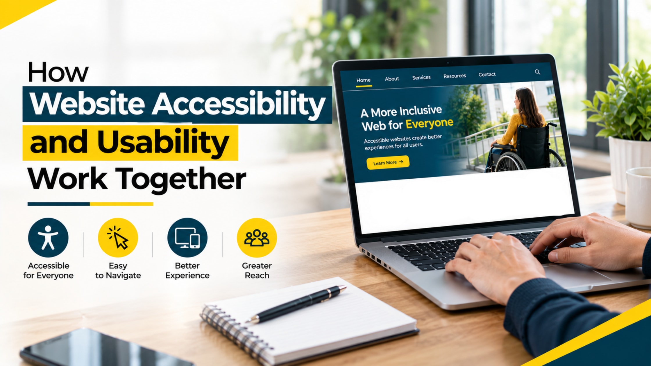
Here is a quick experiment. Open your own website, push the mouse aside, and try to fill in the contact form using only the Tab key.
Can you tell where you are on the page? Can you reach the Submit button? For many visitors, that is not an experiment. It is every single visit. And it shows why website accessibility and usability can't be treated as two separate jobs.
Both come down to one simple question: can real people get things done on your site?
Start with accessibility: who is your site really for?
Web accessibility means people with different abilities can use your site. Someone who is blind may listen to the page through a screen reader. Someone with a tremor may rely on a keyboard or voice commands.
Someone with low vision may zoom in until a single sentence fills the screen. Then add the person squinting at a phone in bright sunlight, or tapping with one thumb while holding a coffee, and the group gets a lot bigger than most owners expect.
Website accessibility standards give everyone a shared rulebook. The best known is WCAG 2.2, a set of global guidelines for spotting and fixing barriers. Still, a rulebook is only a starting point. The real goal is simple: nobody gets shut out because of how something was built.
Most sites are falling short. The 2026 edition of a yearly study of the top one million home pages, based on automated testing, found that 95.9% had detectable accessibility failures. Low-contrast text showed up on 83.9% of them, missing image descriptions on 53.1%, and form fields without labels on 51%. These are not strange edge cases. They are the basics.
Now add usability: is it easy?
Website usability is about how smoothly a visitor gets from "I just landed here" to "done." Can they tell where they are? Do they know what to click next? Does the form ask for only what it needs? Menus that make sense, plain wording and buttons that look like buttons all add up to a good user experience.
Here is an easy way to remember the difference. Usability asks, "Is this easy?" Accessibility asks, "Is this possible for everyone?" A site needs a yes to both.
Where the two meet
The overlap is bigger than most people think. Clear headings let a screen reader user jump around a page, and they help a busy reader skim too. A link that says "see our pricing guide" makes sense to everyone, while "click here" tells nobody anything.
An error message that says "Please enter a valid phone number" beats a field that quietly turns red. Strong contrast helps someone with low vision, and it also helps the person reading through glare on a train window.
That is the idea behind inclusive web design: think about the widest range of people from the first sketch, not after launch. Accessible website design usually ends up as a more usable site for everyone, and a usable site is far easier to make accessible. They feed each other.
Phones deserve a special mention. A responsive website adjusts to any screen, but that is only half the story. Buttons also need to be big enough to tap, text needs to be readable without pinching, and menus should not hide behind mystery icons.
What you get out of it
- More people can finish what they came to do, which may mean fewer abandoned forms.
- Visitors trust a site that feels considerate, and that trust can carry over to the business behind it.
- Fewer confused calls and emails may land in your inbox.
- Descriptive alt text can help search engines understand what an image shows, and clear structure makes a page easier to use and navigate with assistive tools. Rankings are never guaranteed, but a well-organized page gives search engines less to guess at.
Practical ways to improve both
You do not need to start from scratch. Small, focused fixes often make a big difference.
- Check your text contrast. Body text should have at least a 4.5 to 1 contrast ratio against its background.
- Describe your images. Short alt text that explains what the image shows helps screen reader users. Purely decorative images can be skipped.
- Label every form field with visible words, not just faint placeholder text.
- Run the Tab test from the start of this article and make sure you can always see where the cursor is.
- Write links and buttons that say what they do. "Get a quote" beats "Submit."
- Test on a real phone with real people. Automated tools catch missing alt text and weak contrast, but only a human can tell you whether the journey makes sense.
Some problems run deeper, like a confusing layout or a menu that fights every visitor. In those cases, custom web design lets accessibility and usability be planned into the structure rather than patched on later.
Improve Your Website Accessibility with Expert Web Design Services
Your website is often the first handshake someone has with your business, so it should work for everyone. Tonight, try the Tab test and check your contrast. If the fix list runs longer than expected, a team offering web design services can pinpoint the barriers on your current pages, improve how visitors move through them, and build accessible pages from the ground up.
Reach out today for a free consultation and start turning your site into one every visitor can use with ease.