C3-5: Matplotlib
August 29, 2019•1,720 words
L5: Matplotlib and Seaborn Part 1
Bar Charts
\
Imports
import numpy as np
import pandas as pd
import matplotlib.pyplot as plt
import seaborn as sb

%matplotlib inline
\
Read in CSV file
df = pd.read_csv('pokemon.csv')
print(df.shape)
pokemon.head(10)
\
Draw bar chart
sb.countplot(data = df, x = 'cat_var');
\
Change bar color to blue
base_color = sb.color_palette()[0]
sb.countplot(data = df, x = 'cat_var', color = base_color)
\
Change bar order (nominal-type data)
cat_order = df['cat_var'].value_counts().index
sb.countplot(data = df, x = 'cat_var', color = base_color, order = cat_order)
\
Change bar order (ordinal-type data)
level_order =['Alpha', 'Beta', 'Gamma', 'Delta']
ordered_cat = pd.api.types.CategoricalDtype(ordered = True, categories = level_order)
df['cat_var'] = df['cat_var'].astype(ordered_cat)
\
Horizontal bar chart
sb.countplot(data = df, y = 'cat_var', color = base_color)
\
Change rotation of x-ticks via matplotlib's xticks function
sb.countplot(data = df, x = 'cat_var'. color = base_color)
plt.xticks(rotation = 90)
Absolute vs. relative frequency
\
Relative frequency: Calculate proportion
n_points = df.shape[0]
max_count = df['cat_var'].value_counts().max()
max_prop = max_count / n_points
\
Relative frequency: Generate tick mark location and names
tick_props = np.arange(0, max_prop, 0.05)
tick_names = ['{:0.2f}'.format(v) for v in tick_props]
\
Create plot
sb.countplot(data = df, x = 'cat_var', color = base_color)
plt.yticks(tick_props * n_points, tick_names)
plt.ylabel('proportion')
\
Text annotations to label frequencies:
Create plot
sb.countplot(data = df, x = 'cat_var', color = base_color)
\
Add annotations
n_points = df.shape[0]
cat_counts = df['cat_var'].value_counts()
locs, labels = plt.xticks # get current tick locations and labels
\
Loop through each pair of locations and labels
for loc, label in zip(locs, labels):

        # get text property for the label to get the correct count
        count = cat_counts[label.get_text()]
        pct_string = '{:0.1f}%'.format(100*count/n_points)

        # print the annotation just below the top of the bar
        plt.text(loc, count-8, pct_string, ha = 'center', color = 'w')
Count missing data
\
Count missing data in each column
na_counts = df.isna().sum()
\
Seaborn barplot: Depict a summary of one quantitative variable against levels of a second qualitative variable
base_color = sb.color_palette()[0]
sb.barplot(na_counts.index.values, na_counts, color = base3_color)
Pie charts
\
Draw pie chart - data needs to be in a summarized form
sorted_counts = df['cat_var'].value_counts()
plt.pie(sorted_counts, labels = sorted_counts.index, startangle = 90, counterclock = False)

# scaling of the plot is equal on both x and y axes, could be oval shaped without this
plt.axis('square')
\
Donut plot
sorted_counts = df['cat_var'].value_counts()
plt.pie(sorted_counts, labels = sorted_counts.index, startangle = 90, counterclock = False, wedgeprops = {'width' : 0.4};
plt.axis('square')
Histograms
\
Draw histogram (matplotlib)
plt.hist(data = df, x = 'num_var')
\
Set bin edges manually
bin_edges = np.arange(0, df['num_var'].max() + 1, 1)
prt.hist(data = df, x = 'num_var', bins = bin_edges)
\
Create subplot
# 1 row, 2 columns, subplot 1
plt.subplot(1, 2, 1)
# 1 row, 2 columns, subplot 2
plt.subplot(1, 2, 2)
\
distplot
sb.distplot(df['num_var'])
\
distplot without curve, transparency turned off
sb.distplot(['num_var'], bins = bin_edges, kde = False, hist_kws = {'alpha' : 1})
Figures, Axes, and Subplots
Set up figures and axes explicitly in matplotlib
fig = plt.figure()
ax = fig.add_axes([.125, .125, .775, .755])
ax.hist(data = df, x = 'num_var')
\
Use figures and axes in seaborn
fig = plt. figure()
ax = fig.add_axes([.125, .125, .775, .755])
base_color = sb.color_palette()[0]
sb.countplot(data = df, x = 'cat_var', color = base_color, ax = ax)
\
Subplots
Set figure size in inches (larger than normal)
plt.figure(figsize = [10, 5])
\
Create new axes on figure (1 row, 2 cols, subplot 1 and 2)
plt.subplot(1, 2, 1)
plt.subplot(1, 2, 2)
\
Retrieve current axes
ax = plt.gca()
\
Get a list of all axes in a figure
axes = fig.get_axes()
\
Create subplots
fig.add_subplot()
\
Create various subplots
fig, axes = plt.subplots(3, 4) # grid of 12 subplots
axes = axes.flatten() # 3 x 4 array => 12-element vector
for i in range(12):
    plt.sca(axes[i]) # set current axes
        plt.text(0.5, 0.5, i+1) # print subplot index no. to middle of axes
Choosing a plot for discrete data
Non-connected bins with rwidth (not suitable for continuous numeric data)
bin_edges = np.arange(1.5, 12.5+1, 1)
plt.hist(die_rolls, bins = bin_edges, rwidth = 0.7)
plt.xticks(np.arange(2, 12+1, 1)
Descriptive statistics, outliers and axis limits
matplotlib xlim to change histogram's axis limits
plt.figure(figsize = [10, 5])
bin_edges = np.arange(0, 35+1, 1)
plt.hist(data = df, x = 'skew_var', bins = bin_edges)
plt.xlim(o, 35)
Scales and transformations
Using a log10 axis => Problem: Readibility
log_data = np.log10(data)
log_bin_edges = np.arange(0.8, log_data.max()+0.1, 0.1)
plt.hist(log_data, bins = log_bin_edges)
plt.xlabel('log(values)')
\
Scale transformations with matplotlib's xscale function => Problem: Bins are too large
bin_edges = np.arange(0, data.max()+100, 100)
plt.hist(data, bins = bin_edges)
plt.xsclae('log')
\
Evenly spaced powers of 10 as scale
bin_edges = 10 ** np.arange(0.8, np.log10(data.max()) + 0.1, 0,1)
plt.hist(data, bins = bin_edges)
plt.xscale('log')
tick_locs = [10, 30, 100, 300, 1000, 3000]
plt.xticks(tick_locs, tick_locs)
Extra: Kernel density estimation (KDE)
KDE on top of histogram
sb.distplot(df['num_var'])
L6: Matplotlib and Seaborn Part 2
Scatterplots and correlation
matplotlib scatterplot: relationship between two numeric variables
plt.scatter(data = df, x >= 'num_var1', y = 'num_var2')
\
Seaborn's regplot for scatterplot with regression function fitting:
Standard: Linear regression function and shaded confidence region for the regression estimate
sb.regplot(data = df, x = 'num_var1', y = 'num_var2')
reg_fit = False => turn off regression line
\
Plot regression line => data needs to be adapted:
def log_trans(x, inverse = False):
    if not inverse: return np.log10(x)
        else: return np.power(10, x)

sb.regplot(df['num_var1'], df['num_var2'].apply(log_trans))
tick_locs = [10, 20, 50, 100, 200, 500]
plt.yticks(log_trans(tick_locs), tick_locs)
Overplotting, transparency, and jitter
Adding transparency to scatterplot using matplotlib's alpha parameter (0 = fully transparent, 1 = fully opaque)
plt.scatter(data = df, x = 'Ädisc_var1', y = 'disc_var2', alpha = 1/5)
\
Adding jitter with seaborn's regplot function (x_jitter and y_jitter)
sb.regplot(data = df, x = 'disc_var1', y = 'disc_var2', fit_reg = False, x_fitter = 0.2, y_jitter = o.2, scatter_kws = {'alpha' : 1/3})
Heat maps
Matplotlib's hist2d function
bins_x = np.arange(0.5, 10.5+1, 1)
bins_y = np.arange(-0.5, 10.5+1, 1)
plt.hist2d(data = df, x = 'disc_var1', y = 'disc_var2', bins = [bins_x, bins_y])
plt.colorbar();
Change color palette with the cmap parameter in hist2d
Using cmin to set minimum value for coloring a cell
bins_x = np.arange(0.5, 10.5+1, 1)
bins_y = np.arange(-0.5, 10.5, 1)
plt.hist2d(data = df, x = 'disc_var1', y = 'disc_var2', bins = [bins_x, bins_y], cmap = 'viridis_r', cmin = 0.5)
Add text annotations with the count of points to each cell
counts = h2d[0]

# loop through the cell counts and add text annotations for each
for i in range(counts.shape[0]):
    for j in range(counts.shape[1]):
            c = counts[i, j]
                if c > 7: # increase visibility of text on darkest cells
                    plt.text(bins_x[i]+0.5, bins_y[j]+0.5, int(c), ha = 'center', va = 'center', color = 'white')
                elif c >0:
                    plt.text(bins_x[i]+0.5, bins_y[j]+0.5, int(c), ha = 'center', va = 'center', color = 'black')
Violin plots
Seaborn's violinplot function
sb.violinplot(data = df, x = 'cat_var', y = 'num_var')
\

\
Adapt to monocolor, remove miniature box plot inside violins (inner = None)
base_color = sb.color_palette()[0]
sb.violinplot(data = df, x = 'cat_var', y = 'num_var', color = base_color, inner = None)
\
Horizontal rendering
sb.violinplot(data = df, x = 'num_var', y = 'cat_var', color = base_color, inner = None)
Box plots
\

\
Seaborn's boxplot function
sb.boxplot(data = df, x = 'cat_var', y = 'num_var', color = base_color)
plt. ylim(ax1.get_ylim()) # set y-axis limits to the left subplot's, if there is one
\
Horizontal boxplots
sb.boxplot(data = df, x = 'num_var', y = 'cat_var', color = base_color)
\
Violinplot: Plotting three middle quartiles with inner = 'quartile'
sb.violinplot(data = df, x = 'cat_var', y = 'num_var', color = base_color, inner = 'quartile')
Clustered bar charts
\

\
Create clustered bar chart with seaborn
sb.countplot(data = df, x = 'cat_var1', hue = 'cat_var2')
\
Move legend to x-axis
ax = sb.countplot(data = df, x = 'cat_var1', hue = 'cat_var2')
ax.legend(loc = 8, ncol = 3, framealpha = 1, title = 'cat_var2')
\
Heat maps: Summarization of counts into matrix before plotting
Series reset_index and DataFrame pivot
ct_counts = df.groupby(['cat_var1', 'cat_var2']).size()
ct_counts = ct_counts.reset_index(name = 'count')
ct_counts = ct_counts.pivot(index = 'cat_var2', columns = 'cat_var1', values = 'count')
sb.heatmap(ct_counts)
\

\
Adding annotations to the heatmap using fmt = 'd' for integer output
sb.heatmap(ct_counts, annot = True, fmt = 'd')
Faceting
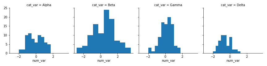
Seaborn's FacetGrid class
g = sb.FacetGrid(data = df, col = 'cat_var')
g.map(plt.hist, "num_var")
\
Extra visualizations as keyword arguments to the map function
bin_edges = np.arange(-3, df['num_var'].max()+1/3, 1/3)
g = sb.FacetGrid(data = df, col = 'cat_var')
g.map (plt.hist, "num_var", bins = bin_edges)
\
Many categorical levels
group_means = df.groupby(['many_cat_var']).mean()
group_order = group_means.sort_values(['num_var'], ascending = False).index

g = sb.FacetGrid(data = df, col = 'many_cat_var', col_wrap = 5, size = 2, col_order = group_order)
g.map(plt.hist, 'num_var', bins = np.arange(5, 15+1, 1))
g.set_titles('{col_name}')
Adaption of univariate plots
Adapted bar charts
Seaborn's barplot function
base_color = sb.color_palette()[0]
sb.barplot(data = df, x = 'cat_var', y = 'num_var', color = base_color)
\
Seaborn's pointplot function
sb.pointplot(data = df, x = 'cat_var', y = 'num_var', linestyles = "")
plt.ylabel('Avg. value of num_var')
\
Adapted histograms
Bar heights indicate value other than a count by using the "weights" parameter
bin_edges = np.arange(0, df['num_var'].max()+1/3, 1/3)

# count number of points in each bin
bin_idxs = pd.cut(df['num_var'], bin_edges, right = False, include_lowest = True,
                  labels = False).astype(int)
pts_per_bin = df.groupby(bin_idxs).size()

num_var_wts = df['binary_out'] / pts_per_bin[bin_idxs].values

# plot the data using the calculated weights
plt.hist(data = df, x = 'num_var', bins = bin_edges, weights = num_var_wts)
plt.xlabel('num_var')
plt.ylabel('mean(binary_out)')
Line plots
Matplotlib's errorbar function
plt.errorbar(data = df, x = 'num_var1', y = 'num_var2')